Andy Small:
Andy Small is a Flower, Nature and Landscape photographer. He takes dramatic close up portraits of nature; particularly flowers, and landscapes. His work has become known for its modern graphic style and striking use of colour.
Examples of His Still Life Photography:
|
|
|
|
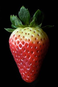
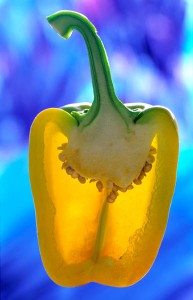
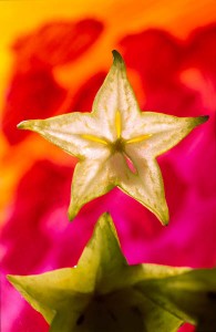
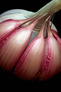
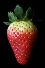
The photos I have chosen to analyse feature fruit and vegetables as the main subject. The colours in the photos are very striking and are highly saturated. The background of the photos are out of focus and blurred as they have a small depth of field due to being taken with a larger aperture (lower f-stop). The background in most of the photos is composed of bright contrasting colours whilst in some the images fades out into a solid black background. The subject of the photo has been taken as a close-up and some parts of some images are out of frame. The images are naturalistic. The photographer has managed to create an effect which makes it seem as if the images were floating.
These photos would have most likely been taken on a DSLR camera with added light coming from soft boxes. These photos could have been taken from a close up angle looking down on the subject which would have created the floating effect. The light and shadows created by the artificial light help give the image depth and bring out the slight details in the photo. The textures shown in the photo appear smooth due to the light and where it is hitting the subject.
These photos would have most likely been taken on a DSLR camera with added light coming from soft boxes. These photos could have been taken from a close up angle looking down on the subject which would have created the floating effect. The light and shadows created by the artificial light help give the image depth and bring out the slight details in the photo. The textures shown in the photo appear smooth due to the light and where it is hitting the subject.
|
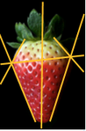
On the photo of the strawberry your focus moves up and down from where the light hits it (around the cross intersection. ) The photographer has captured the play of light into this photo to make the colours vibrant, especially the red tones. This picture is different from real life because it is more bright and shiny looking. What interests me most about this photo is how the strawberry fades to black on one side but remains a solid colour on the other, this interests me because it makes the strawberry look 3D.
|
|
In the photos of the strawberry and pepper, space is represented behind and around the subject as a border. In the photo of the star fruit, space is represented in a similar way however it is interrupted by an out of focus piece of the fruit. In the photo of the onion, very little space is represented, it is above and below the subject but not to the sides as the subject is at a much closer angle to the camera than in the other photos. My knowledge of the artist and his work effects my understanding of these images because I know that the reason he takes photos in this style is that he is "fascinated by the intricate structure and design found in nature" and that because he is known for his use of colour, his photos include elements of striking colour.
I think his use of colour is what is most interesting about his work, if he had used more muted tones, the images wouldn't be as interesting and/or memorable. Personally, I don't think (that in the photo of the star fruit) having the out of focus fruit at the bottom of the image works too well as I think that it interrupts the flow of the image.
Overall, my favourite image is the one of the pepper because of the use of contrasting colours. I think this because the colours used make the subject really stand out from the background.
